Encouraging ideation with a tokenized design system.
Product Design Intern — Interaction Design, User Interviews, User Flows, Design Systems
Emma Rapp, Product Manager
Alejandro Lobos, UX Designer
2 months, implemented in August 2023
Overview
This past summer, I worked as a product design intern at Relentless Software Solutions, an international software consulting company based in San Diego serving dozens of clients every year.
During my 8 week-long internship, my main contribution was spearheading Relentless’ first design system in Figma, Portra, after realizing how time consuming it was to design solutions for clients with different product requirements.
Due to project cancellations and lack of access to files after concluding my internship, I'm unable to share specific details about the client apps I worked on. However, feel free to reach out if you want to hear more about my experience.
Highlights
Create seamless user experiences across client projects.
Context
Disjointed user experiences.
When I joined the team, there was no existing design system that was shared across projects. As a result, client software products ended up looking and feeling very different from one another, thus diluting Relentless' brand and design voice.
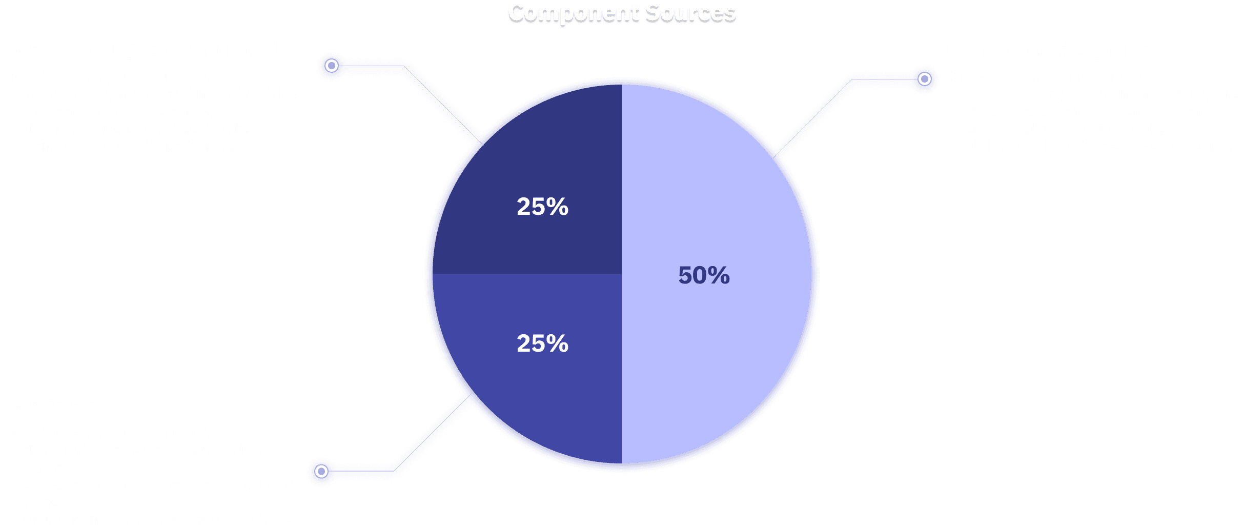
Figma File Audit
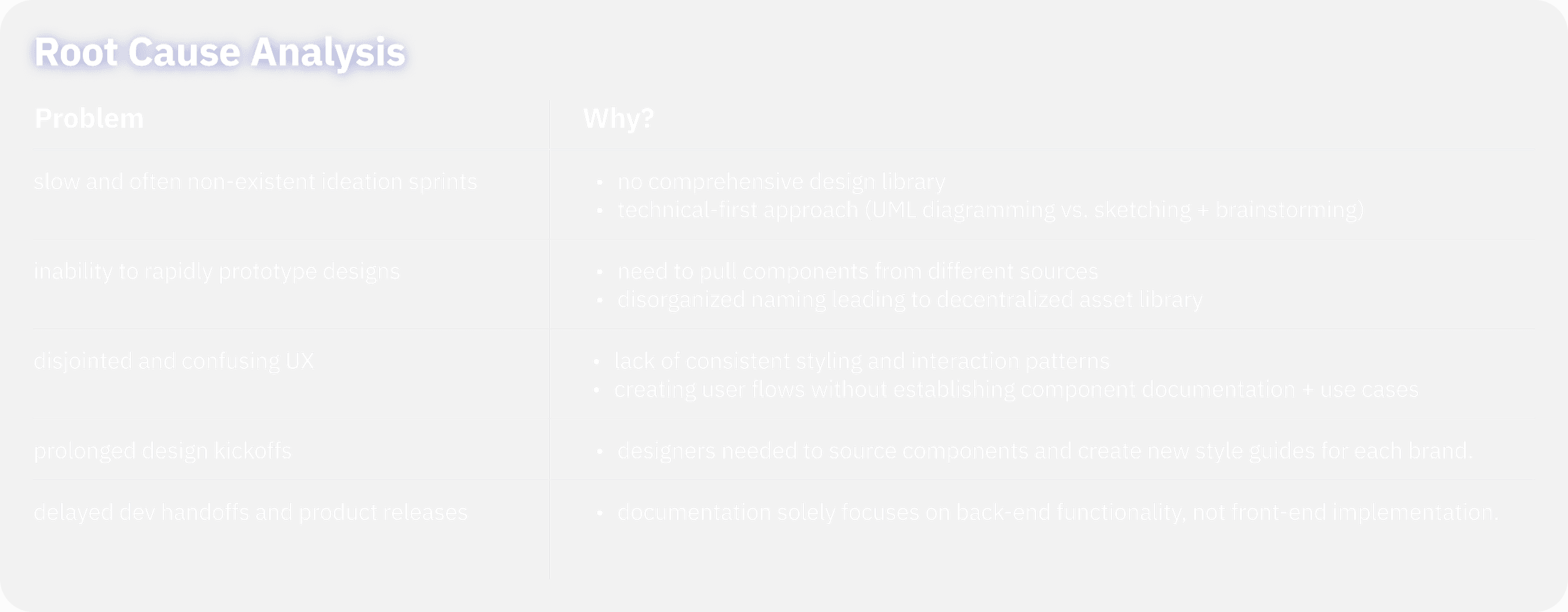
I audited 5 different design files from past and current client projects. I noticed several things about the files:
Problem Space
Creating a universal design language.
How might we standardize and document design components in Figma to create more consistent user experiences and speed up ideation, prototyping, and development handoff across multiple projects?
Opportunities
Learning from the best.
I first did research on established design systems from Material Design, Human Interface Guidelines, and Shopify Polaris and found several common traits that make these design systems extremely scalable and intuitive.
Clear hierarchy of design system elements: Levels of design components allow designers to expand the design system on a semantic and pattern level while maintaining consistent basic styles and properties.
Examples for usage: While some components and patterns seemed similar, the documentation provides visual examples of when and how to use each element. This helps to create a more cohesive user experience across multiple use cases.
Code and function based documentation for developers: Shopify’s design system was unique in that it provided code snippets for each component. This makes it easy to connect the functionality and properties of the design assets/patterns with implementation ideas.
Considerations for responsiveness: Given that products from these industry giants live on multiple device formats, it is very helpful for the design system to contain interaction specifications to make each device usable.
Solution
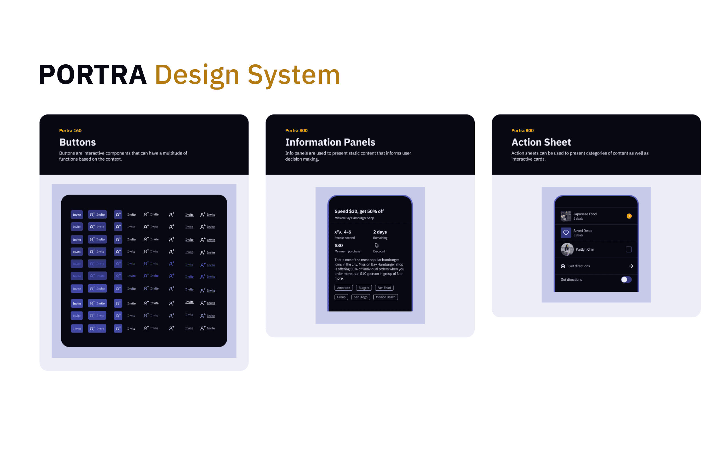
Portra Design System
As I worked on client projects, I used my experience to build, document and gather feedback on the design system. The name “Portra” comes from the popular film stock, known for its flexible application in all genres of photography.
Improving scalibility
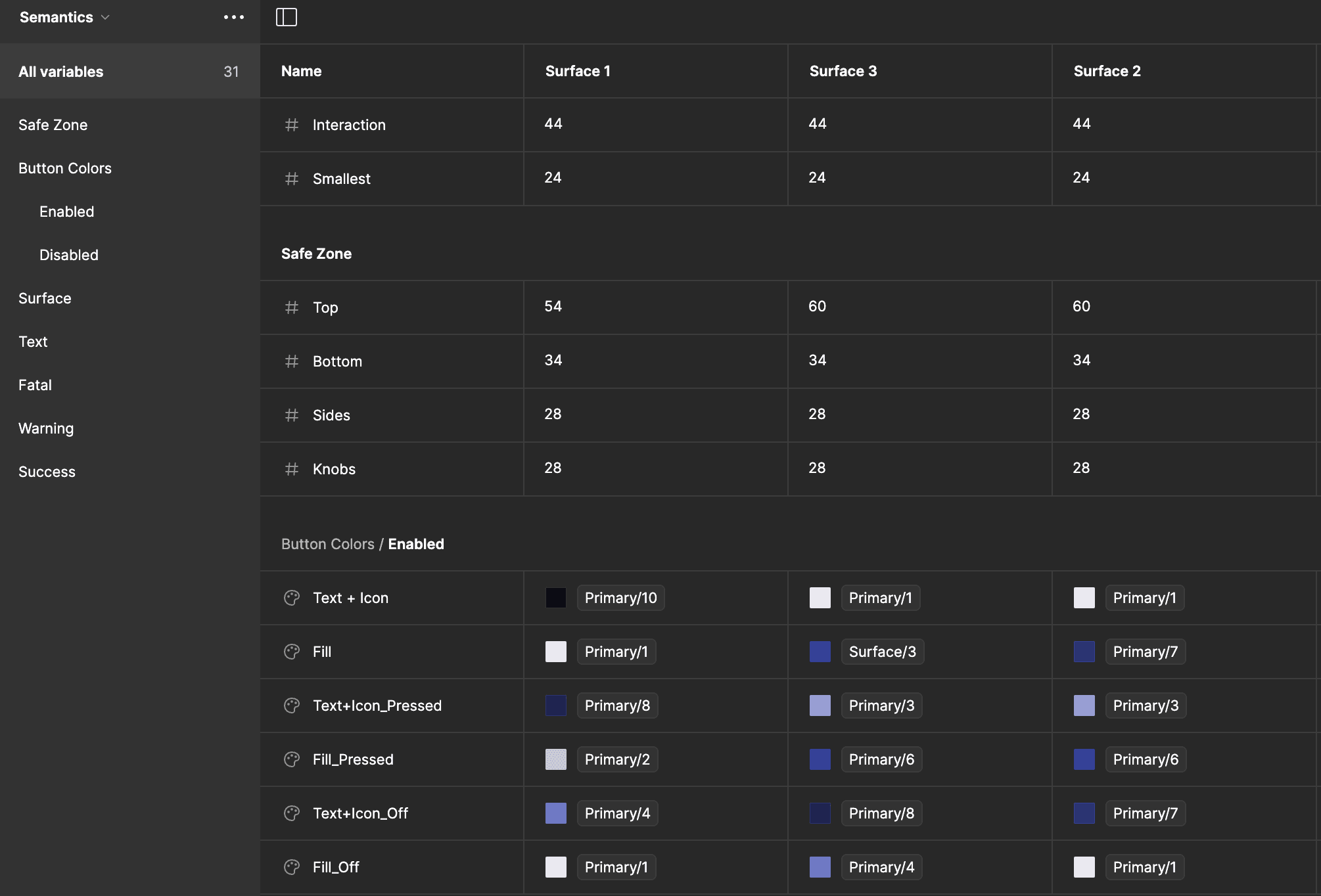
I utilized Figma’s new variables feature to create a design token system for primitive and semantic properties. This simple hierarchy enables quick universal changes across projects or ideation sprints by simply adjusting the primitive values of a design file
Consolidated component sets
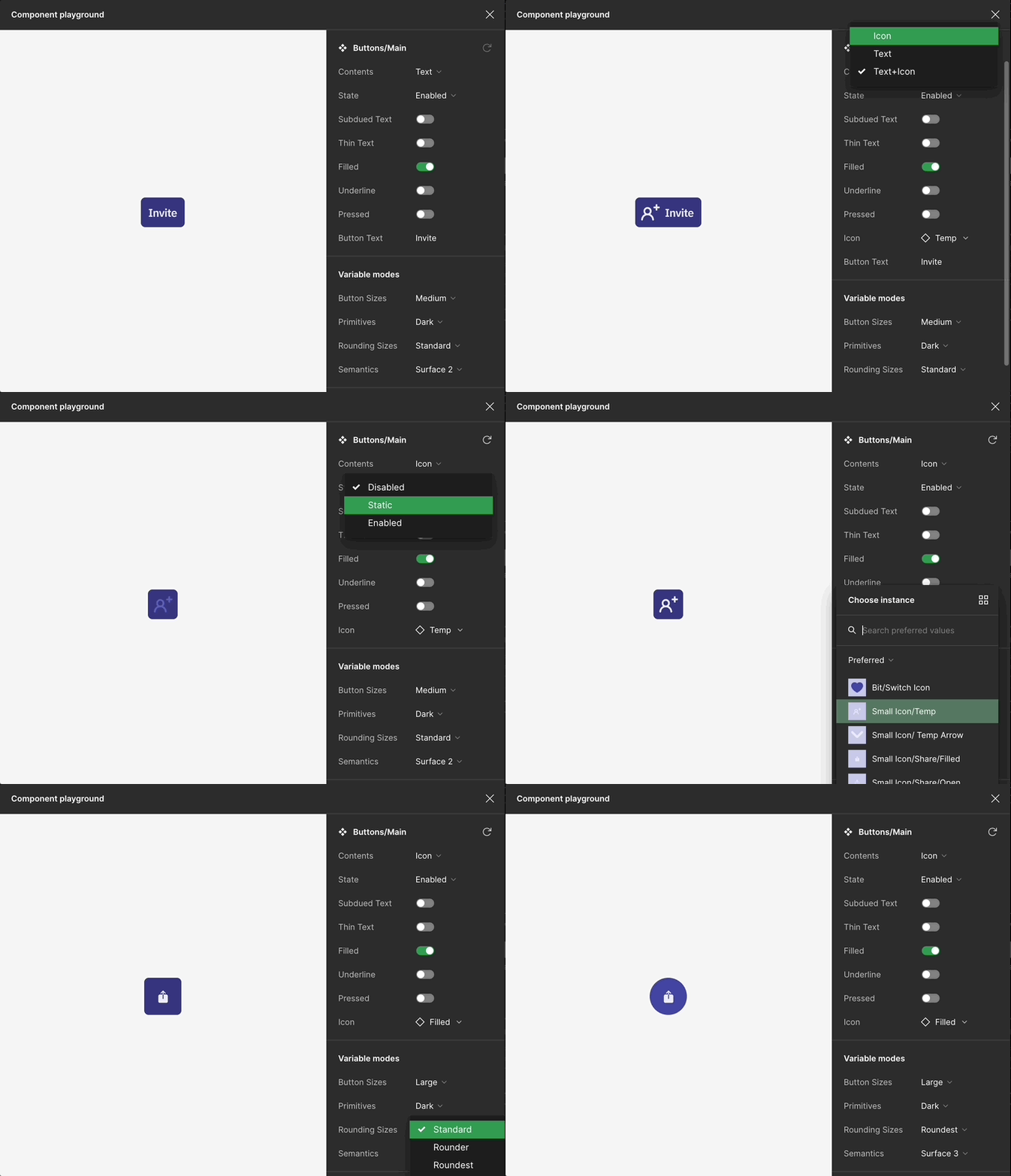
While some components, such as buttons, originally contained 100+ variations, using variants, variable properties, and instance swap allowed me to create a single component modifiable from the properties panel.
Rapid prototyping and ideation
Organizing components using consistent naming conventions allowed me to create a drag and drop functionality in the asset library. Combined with nested instance swaps and component variants, this system allows designers and non-designers alike to quickly ideate UI solutions and user flows.
Cross-project brand styling
To address varying brand styling between projects, I used variable modes within a primitive design token collection to switch between color schemes and other properties. This allows branding to be updated with the click of a button.
Iteration
Supporting developer handoff.
When I started creating the design system, our team had not met with development yet. Thus, after our first meeting with our offshore developers from Uzbekistan, I found a need to better document the library for developers to quickly understand how to implement each design element.
Practical design
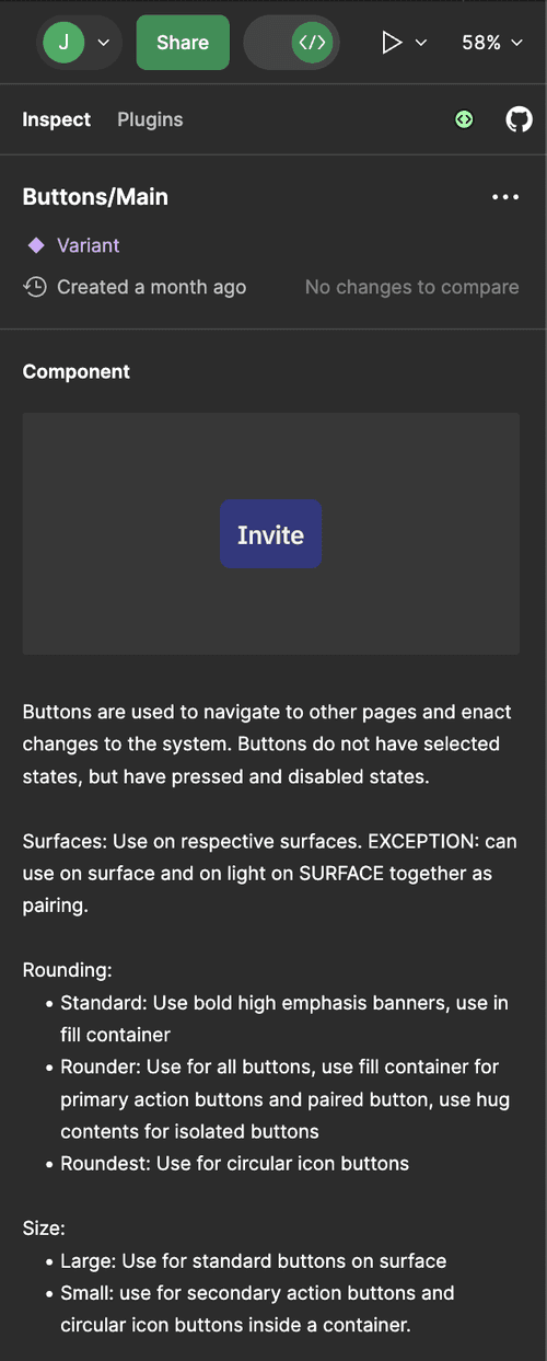
Documenting the function and use cases for each component in the properties panel helped to centralize all important information for new designers and developers.
Impact + Learnings
Encouraging creative exploration.
My PM and Principal Designer both reported this system helped them prototype with “more creativity” and explore different solutions, “rather than get pigeonholed” into the first design created, consequently speeding up our design timeline by nearly a week.
Seek mentorship. Without my PM and Principal Designer’s help, I wouldn’t have been able to learn so much about design systems and how to work with a team to successfully deliver a real product.
Communication is everything. While my team of designers and PMs was extremely talented, we struggled at first to quickly explore new ideas and build experiences together that felt cohesive. By defining roadblocks in our workflows, I was able to create a solution that not only improved our ability to innovate our UI designs, but also communicate our ideas and creations.
Design agencies move fast. This was my first time working in a design agency and it required me to always be ready for whatever task was thrown at me. There was never a consistent workflow or schedule which meant I had to take initiative to make sure designs were completed on time.
