UX Designer— Prototyping, Product Roadmap, Discovery Research, Usability Testing, CSAT
Tung Dao, SWE
Jesse Lutan, SWE
3 months, development started in April 2023
Overview
Loupe is a desktop app built for photographers to visualize colors and light in photos to enable fine-tuned edits in Adobe Lightroom.
In its beta release, usability issues and lack of adoption by target segments sparked a need for a redesigned UI and user flow that catered towards a less technical audience.
I owned the end-to-end design overhaul of the desktop experience. The app’s user testing release was met with outstanding feedback from 20+ end users and is currently in development.
Highlights
Enabling photographers to fulfill their creative visions by turning complex color and luminance data into actionable Lightroom editing insights.
Context
Too little exposure.
While visualization tools are fundamental in videographers' workflows, they are hardly ever used by photographers. In our discovery research, none of the photographers we surveyed had ever used a visualization tool before (besides a histogram).
Question
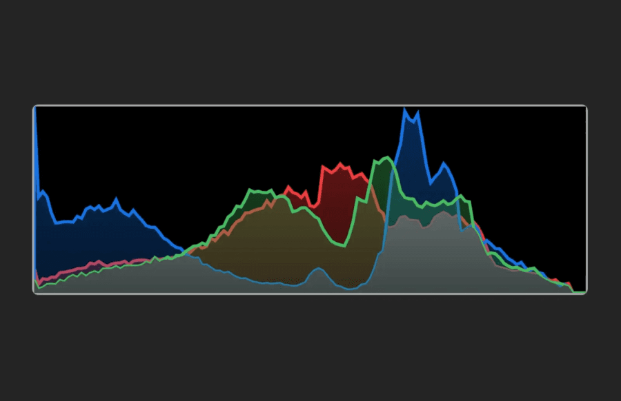
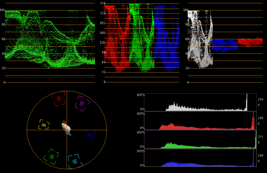
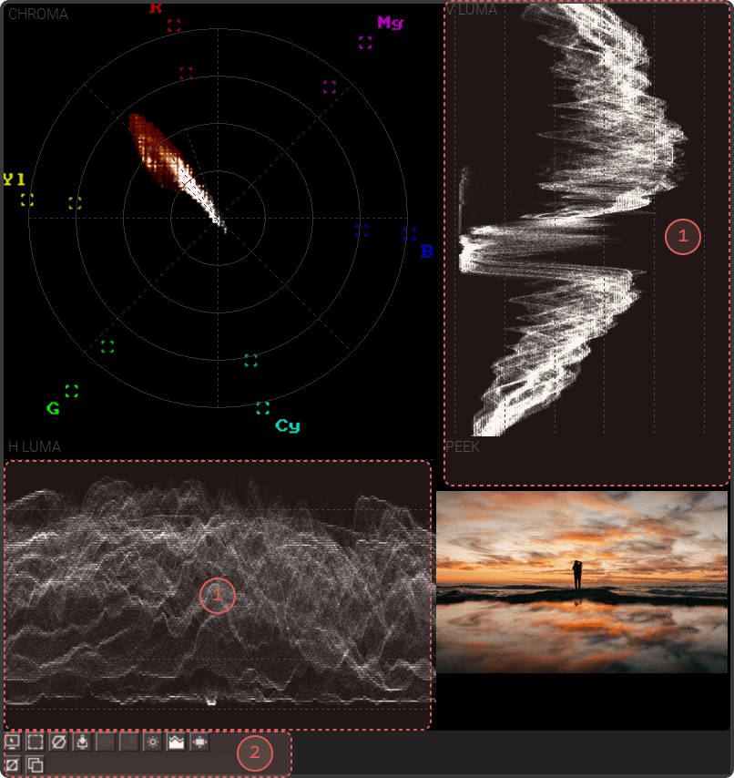
The images below show the difference between visualization options for photographers (Lightroom) and videographers (Premier Pro). Why are there so few visualization tools in photo editing platforms?
Adobe Lightroom Histogram
Adobe Premier Pro Visualization Suite
Problem Space
A foreign technology.
Through user interviews, survey responses, and product workshops, I found that photographers who were reluctant to use visualization tools had several common gripes.
1
Too abstract and indirect. Photographers are more familiar with high-level editing software like Lightroom, which uses direct image manipulation to make adjustments.
2
Lack of organization. Features are hard to discover due to a lack of modularity. This also affected the learnability of new use-cases for visualizations.
3
Not optimized for photos. The interface more closely resembled that of video editing workspaces. The experience felt out-of-place in their existing workflows.
User Interview
"I am dabbing into post-processing and I do struggle to achieve that 'professional' look. The struggle is not with 'how to do' but rather 'what to do'."
Opportunities
Photographer first design.
Rather than simply repackaging existing video visualization tools and marketing them to photographers, an entirely new interface was needed to make Loupe feel at home in photo-editing workflows.
1
Inspiration to creation. Many photographers try to replicate an editing style by using presets from their favorite artists. What if there was a way to analyze images to get an even closer result?
2
Encourage learning. Loupe would likely be many photographers' first exposure to visualization tools. How can we make unfamiliar use cases more discoverable and learnable?
3
Lightroom integration. Users should feel like they are still in Lightroom when using Loupe. Can we make the interactions in Loupe more intuitive to create a seamless user experience?
Metrics
Defining success.
Our overarching goal for Loupe's redesign was to attract a less-technical segment of photographers and increase feature usage within the app. Since the app was in its discovery phase and not officially shipped, our metrics aimed to reveal product-market fit.
1
Increase novice user satisfaction. When conducting usability tests and surveys with users who have never used Loupe or any visualization tool before, we hope users are satisfied with the product and don't feel overwhelmed by it.
2
Improve task completion rate for feature discovery. Loupe Beta struggled from feature discovery issues, leading many users to question the use-cases for the app in photo-editing. The redesign should address these shortcomings to enable users to learn and use features quickly.
3
Increase user retention. Users should want to continue to learn how to use Loupe in their existing workflows and not stop using or delete the app due to frustrations with the UI, learnability of features, etc.
Explainer
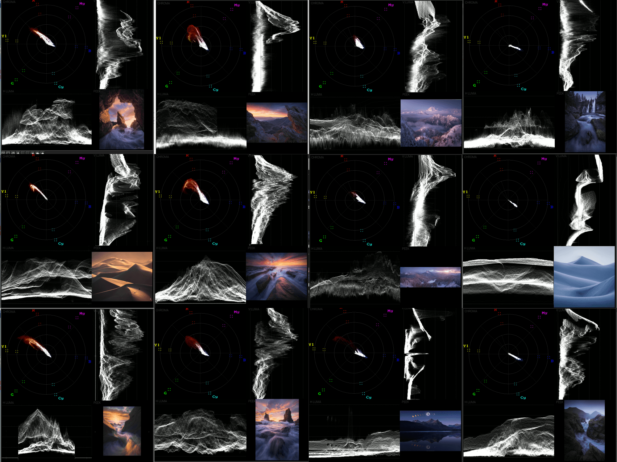
What the heck are photo visualizations?
Histograms, vectorscopes, and luma scopes, are all likely words you've never heard before. Put in simpler terms, photo visualizations are tools that display light and color as a function of saturation, brightness, hue, or image region to achieve consistent color and exposure.
Loupe Beta Audit
Lacking usability fundamentals.
My PM saw the value of visualization tools for photographers and created the first functional prototype of Loupe. While it was a novel attempt at creating a new tool, first-time users found the app's interface hard to navigate. I independently audited the app and found the following:
2a
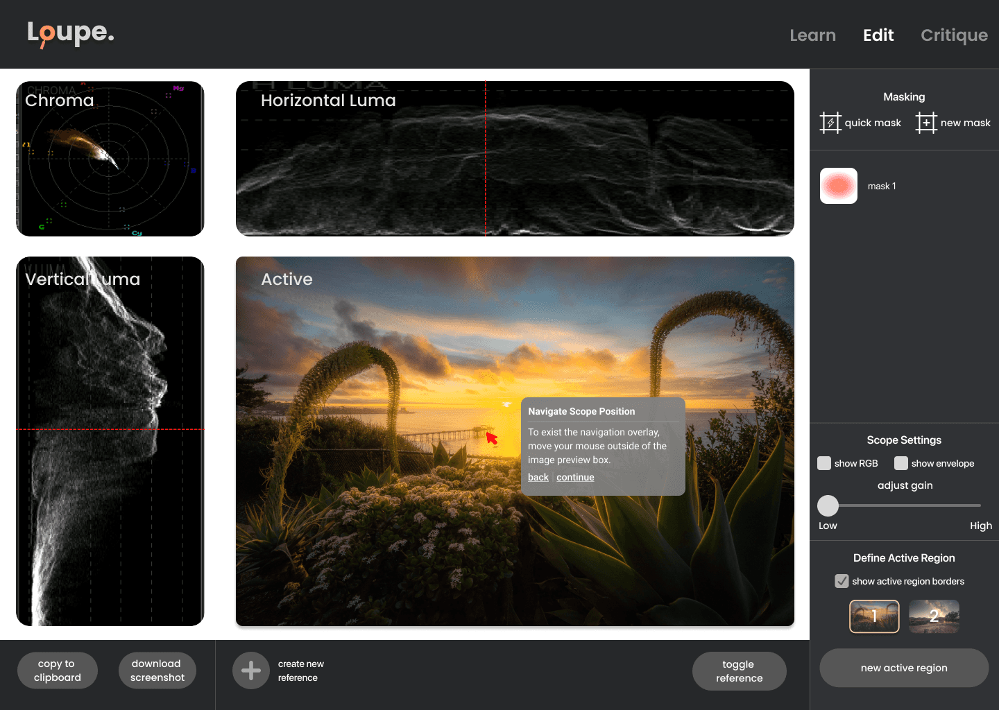
Visibility of system status. Unclear system status prevents users from confidently performing image analysis.
2b
Recognition over recall. Icon buttons aren't intuitive and don't express their functionality clearly.
Solution
Optimizing layout for creative analysis.
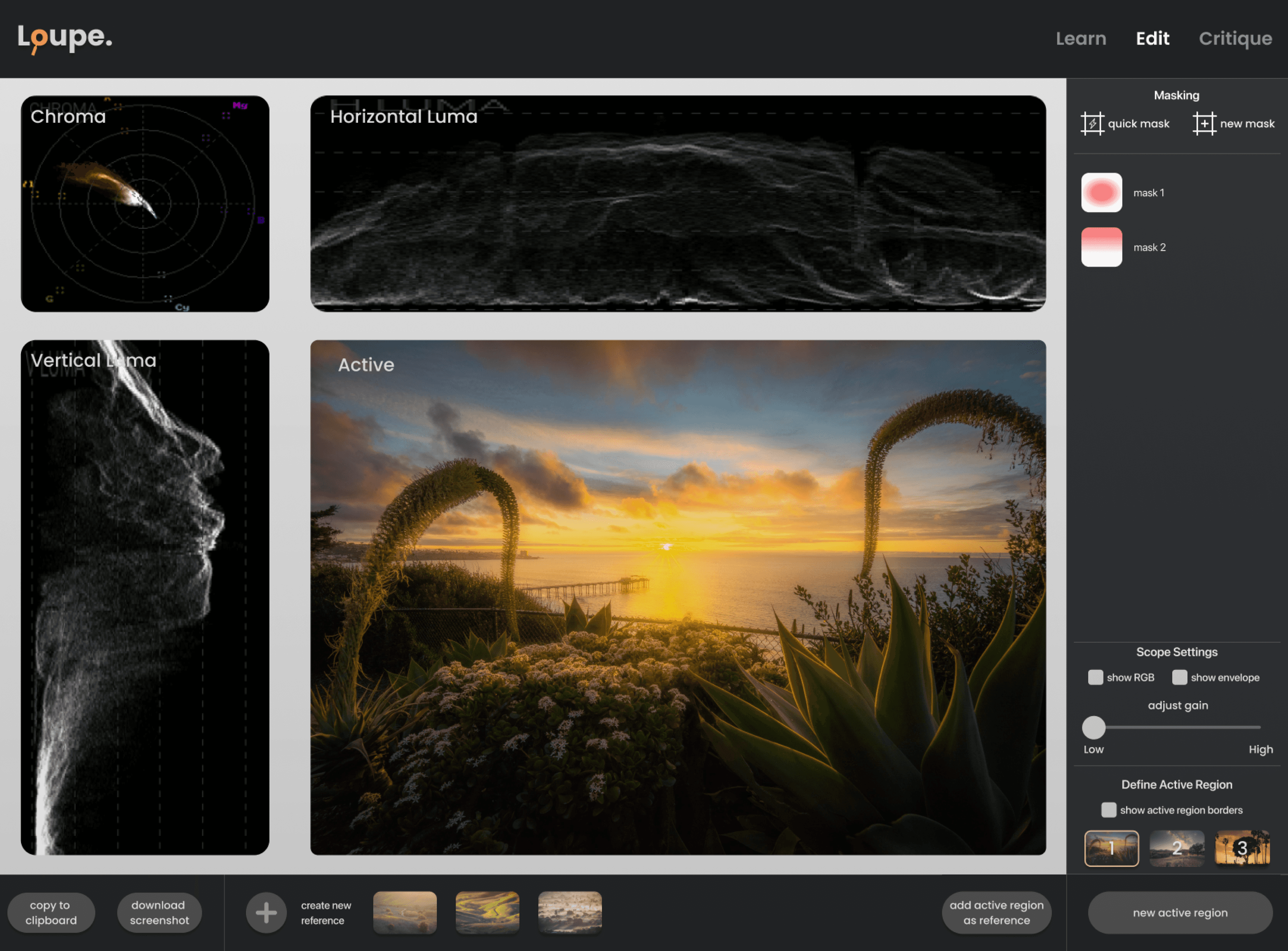
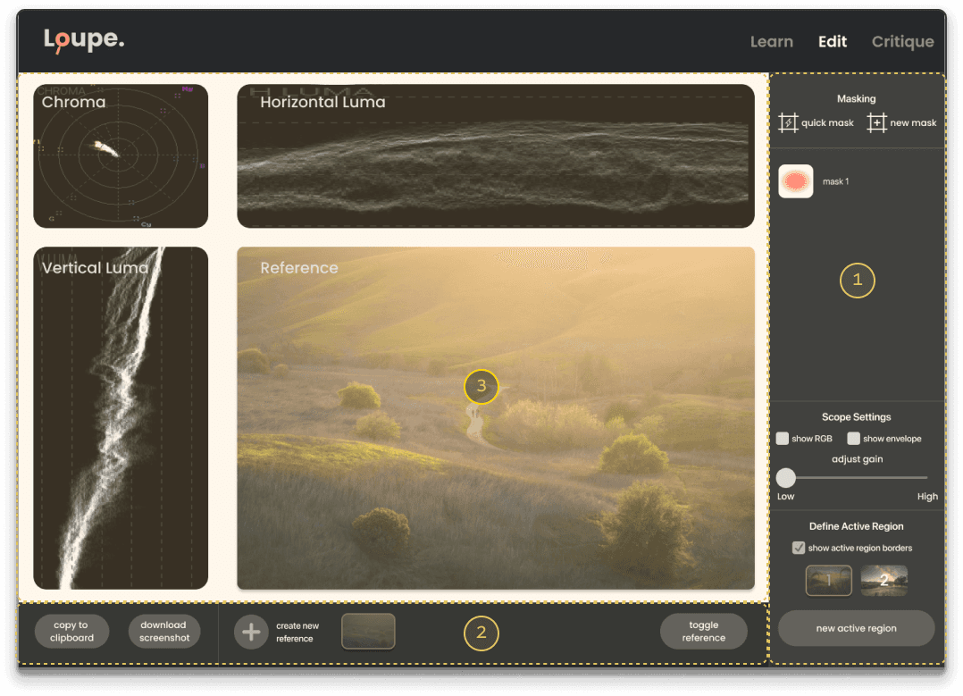
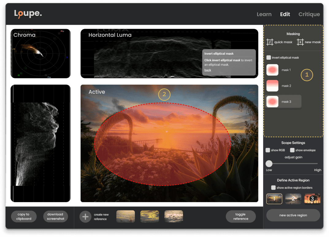
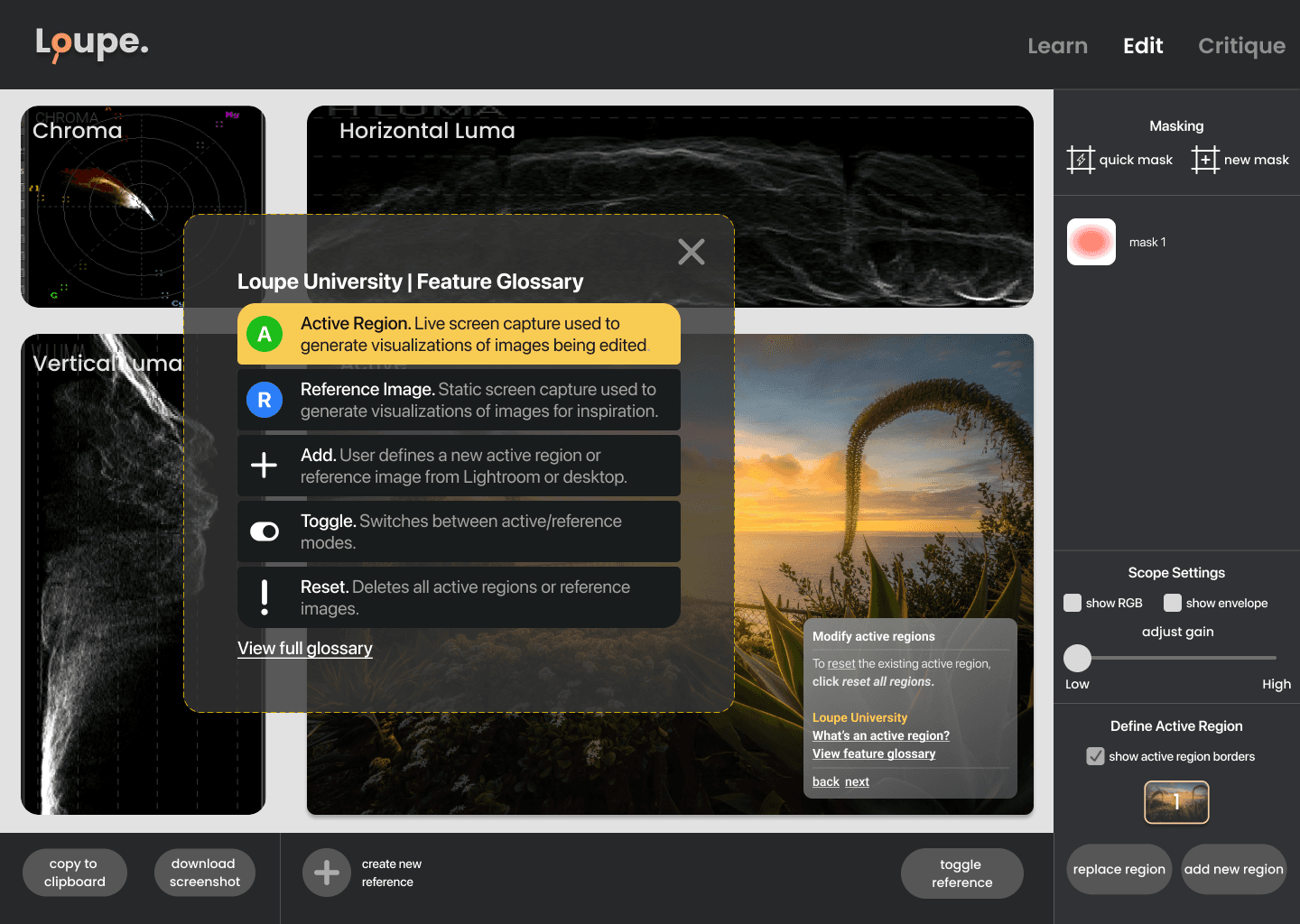
One of my main design principles was to create a task-driven layout. Users should be able to confidently navigate the interface and discover unfamiliar features with ease.
Modules
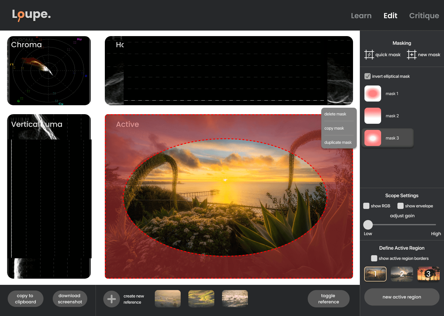
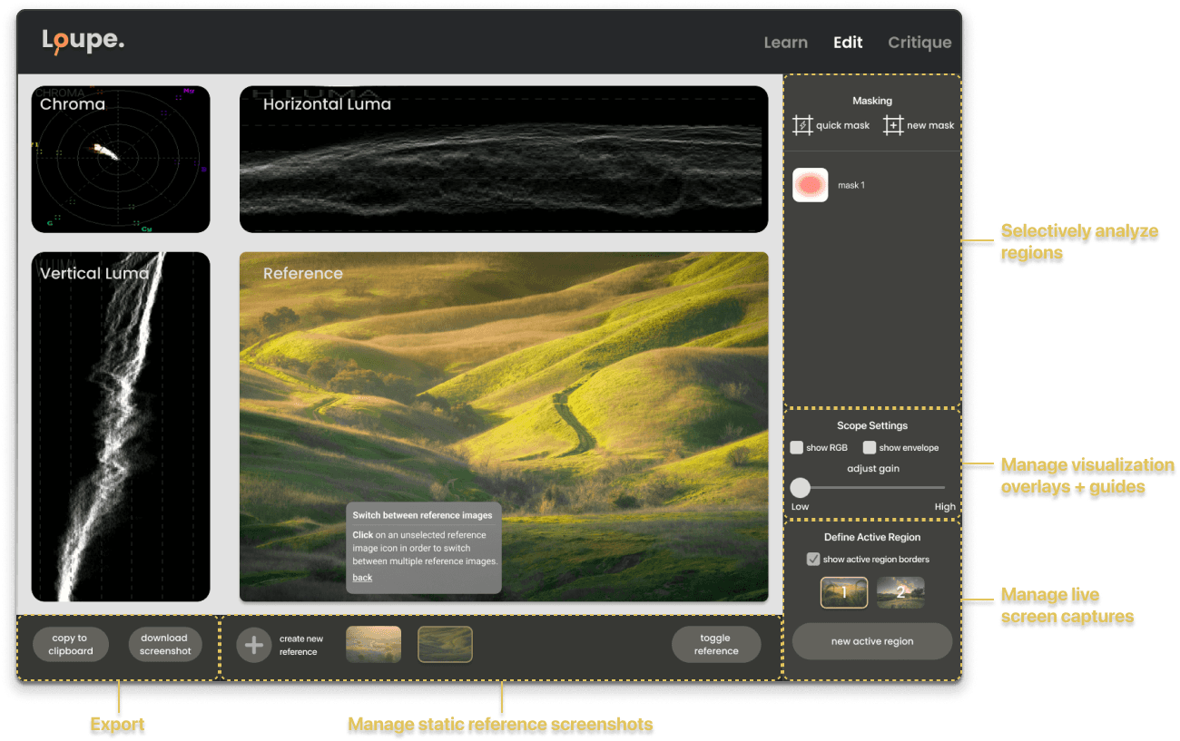
I consolidated similar use cases into distinct modules to make it easier to discover possible workflows. Checkboxes and sliders were added to more directly manipulate overlays and settings.
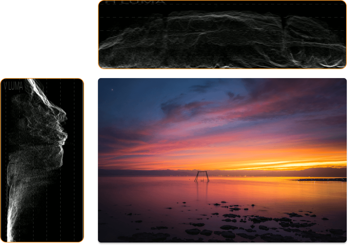
Position Mapping
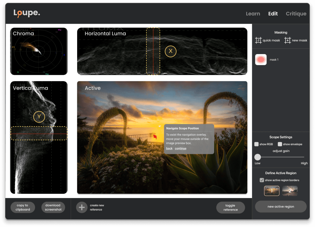
The horizontal and vertical luma scopes were rearranged to align with the corresponding image edges. I also added a line overlay on each scope to more accurately reflect the mouse position on the image.
Responsiveness
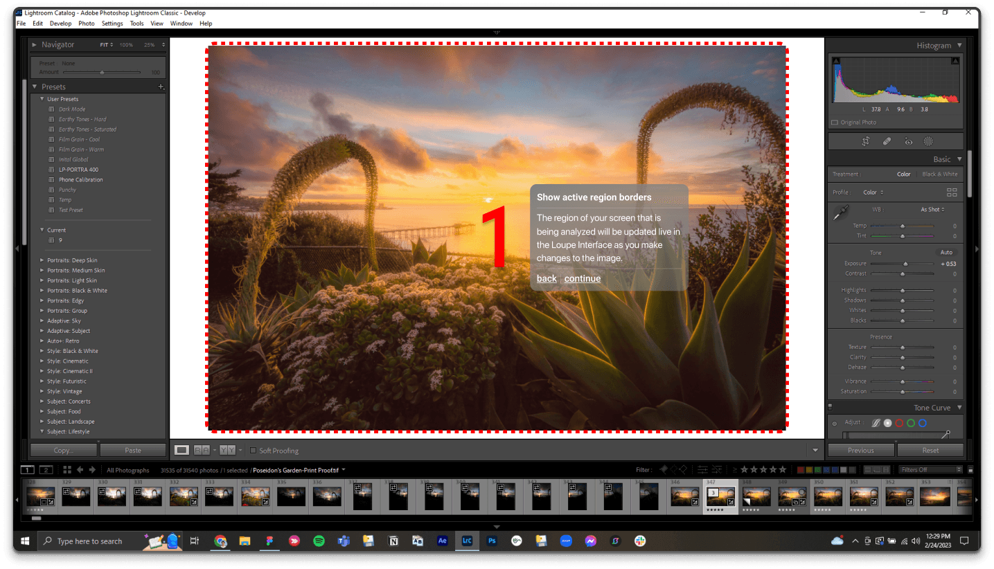
I used responsive desktop breakpoints and flex box properties to allow the interface to scale dynamically. This enables users to position Loupe on multiple monitors or on the same screen as another editing window.
Solution
Supporting image comparison.
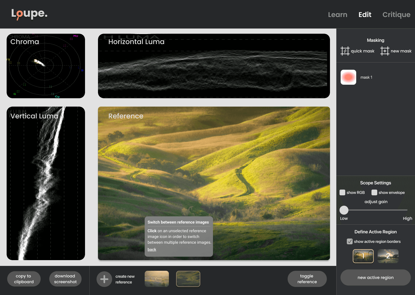
One of the core features of Loupe is the ability to compare your image to a reference image to draw inspiration. However, the quantity and complexity of actions for this workflow depended on finding the most intuitive interaction patterns.
Understanding the use cases
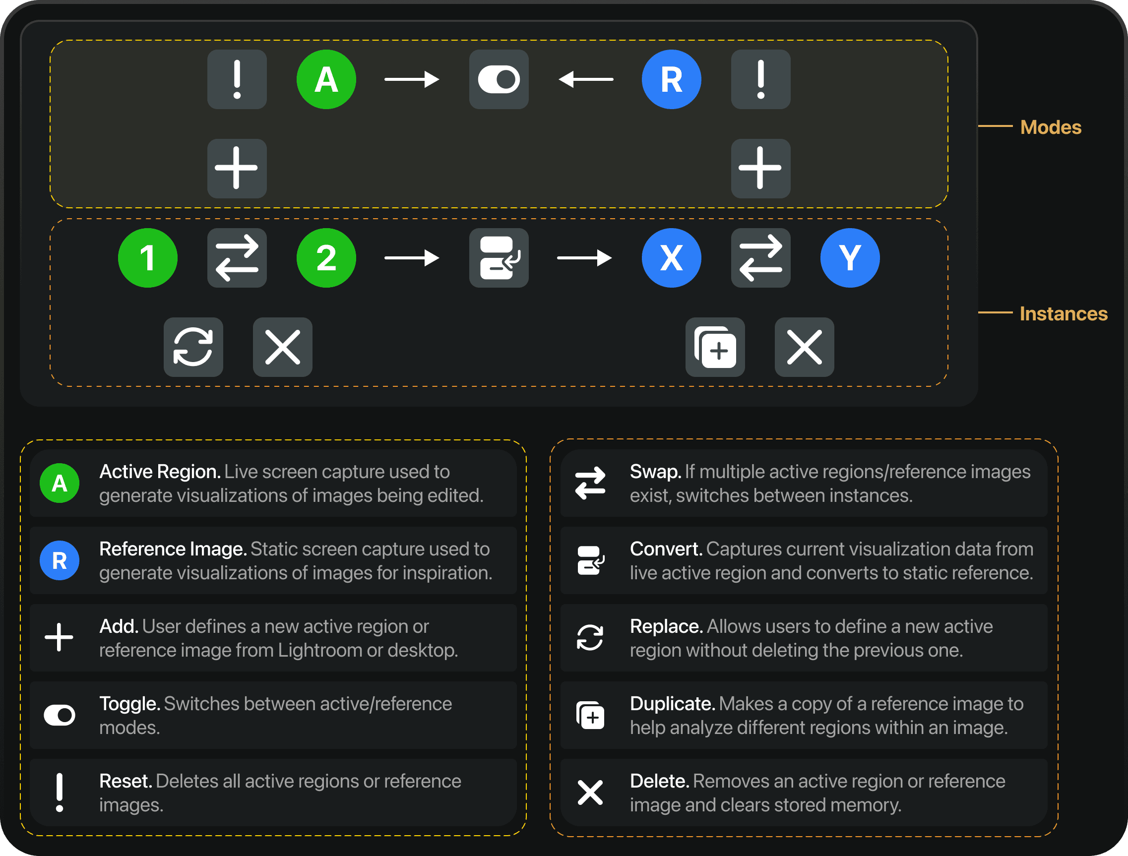
I broke use cases up into two categories: modes (globally affecting all existing images) and instances (locally affecting instances of modes).
Hypothesis
It’s easier for users to discover and perform actions when they are grouped by complexity.
Interaction Patterns
Based on my hypothesis, I defined interaction patterns for each category.
A/B Testing
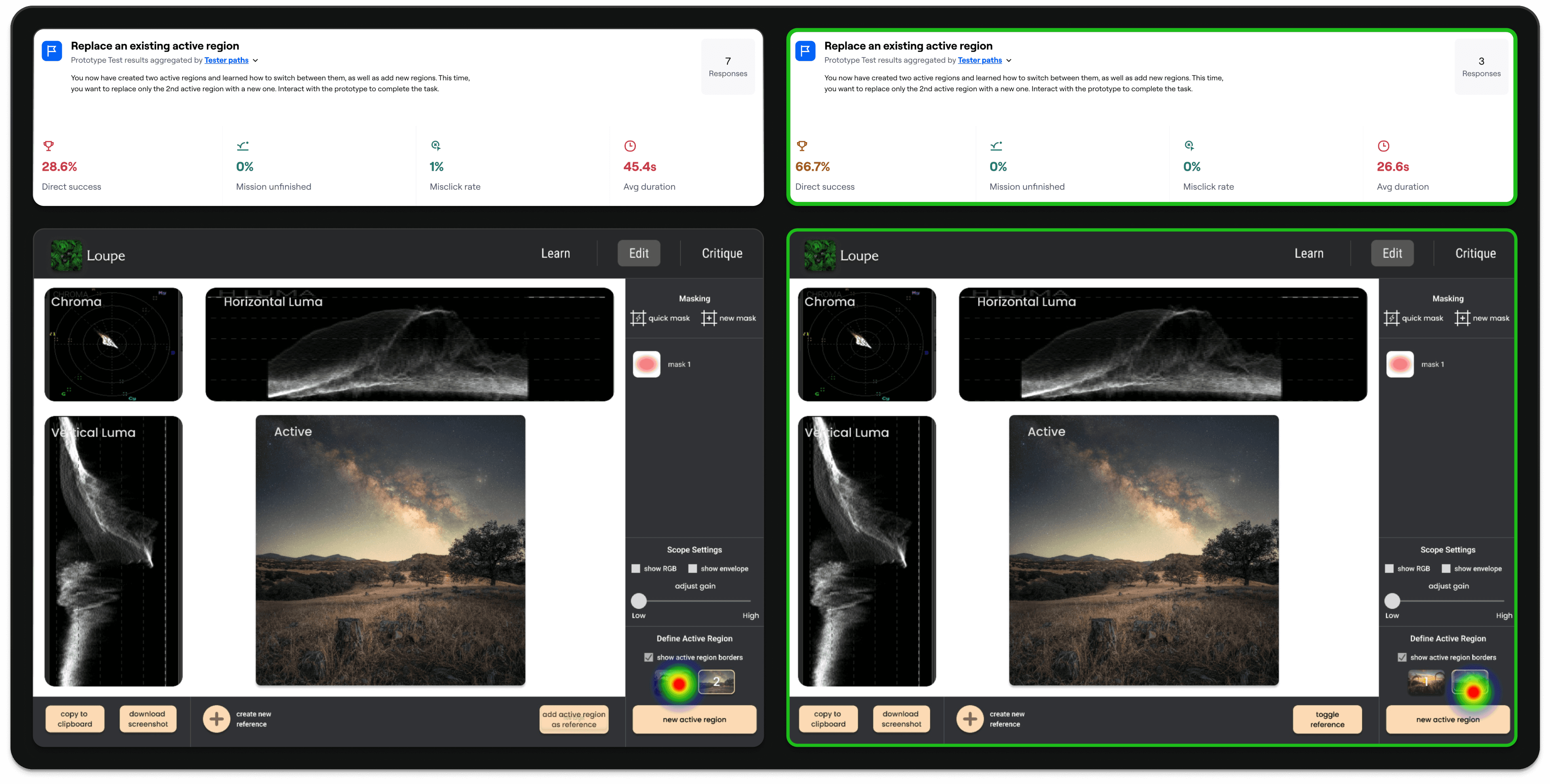
I tested two designs (control vs. grouped by complexity) on 20 users (remote unmoderated in Maze), and found that defining interaction patterns by difficulty lead to significantly faster task completion and higher usability ratings.
Iteration
Content design is essential.
While I had created an onboarding user flow for testers to review before beginning the testing tasks, I didn't spend much time polishing the UX writing and microcopy. As a result, many testers reported that the onboarding instructions were too vague and poorly explained each feature.
Iteration Feedback
"Easy to do but instructions were a little confusing at first."
Impact
Lowering the technical barrier.
Previously, the lack of familiarity and usability of visualization interfaces prevented photographers from even considering using these tools. However, by creating an experience built specifically for photographers, potential users are now more curious and open to see how Loupe can suit their creative needs.
Novice users were hooked. After testing Loupe, less-technical users felt more confident in analyzing visualizations and were no longer as reluctant to learn a new tool. This indicated the redesign succeeded in meeting more beginner photographer's editing needs.
Successful feature discovery. In our A/B test comparing feature discovery task completion, users testing the redesigned Loupe version were 130% more successful than those in the control group. This indicates our redesign was successful in helping users discover use-cases and thus find value in using the app.
Increased user retention. All of our testers in the redesigned Loupe A/B test group reported being willing to continue to learn and use the app, whereas those in the control group were less likely to continue using the it.
User Quote
"The prototype was intuitive to use. The only (unrelated) challenge was that I haven't used this type of image analysis before. Looking forward to learning more about it though."
Learnings
Users are the best problem solvers.
When I first started working on Loupe, I was skeptical that photographers would actually want to use such a foreign tool. As a photographer myself, I wondered if there was a valid reason for us not to use something so complicated. However, collaborating with users taught me several valuable lessons.
1
Use what you have. Given our team only had one SWE, I had to ensure that the final design built off of the previous features and integrations from Loupe Beta. Working within these constraints helped me focus on addressing the most pressing needs of users without drastically changing the functionality of the app.
2
You're not the expert. Though I have years of photography editing experience, I had to learn to put aside my own ego and listen to how photographers of all experience levels approached working with a new tool. This enabled me to identify new pain points and ways of communicating functionality to users.
3
Be excited about the product. Although Loupe was not fully polished when we released let users test it, my team's passion and enthusiasm for our creation encouraged new users to see how the tool could benefit them. Doing so helped testers push past initial doubts and provide us with constructive feedback.
